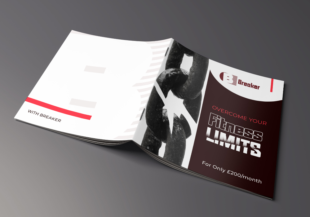
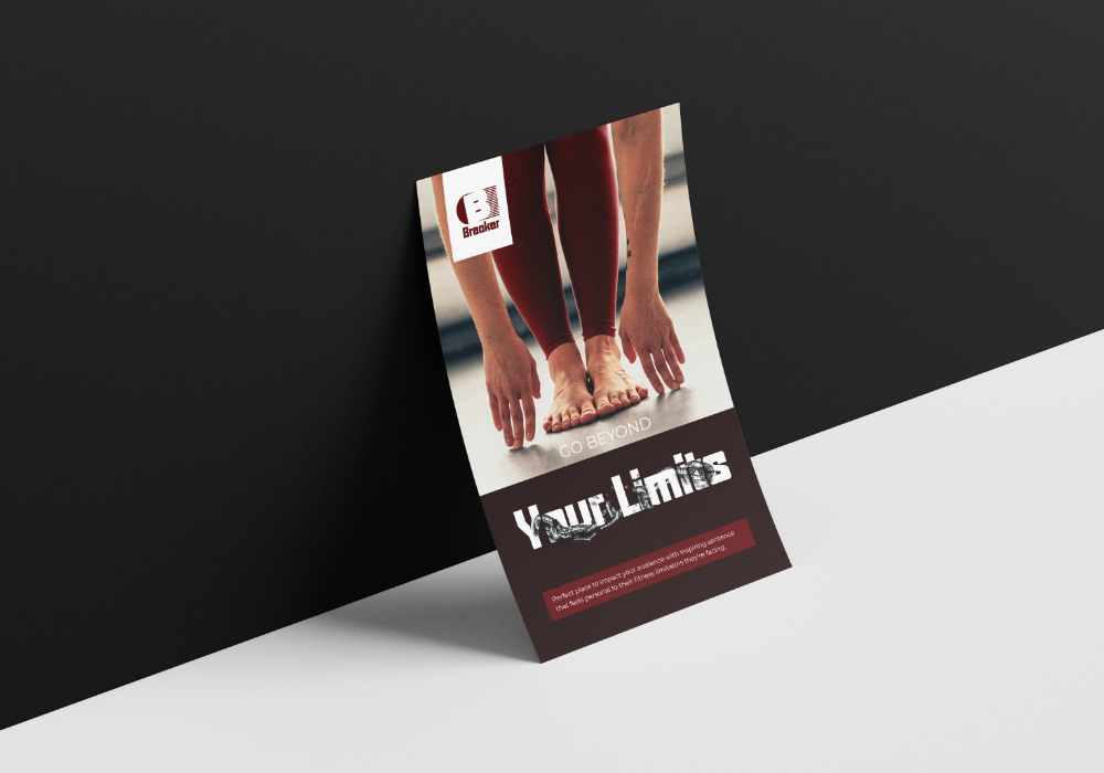
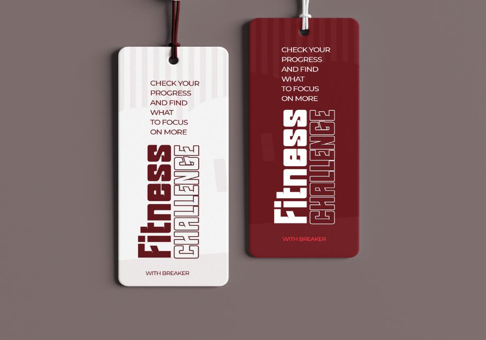
I used a deep shade of red in respect of Breaker’s state of stability and being a matured brand with another tone in dark yet noticeable to convey strength or energy found in Breaker. The soft lightest reddish tint is unrebukable as it feels love, care and sympathy, while pure white helps Breaker feel peaceful and reconciling to the bruised bracket of people
Bold-square shaped font represented Breaker’s energy and stability and also encourage their audience to feel the same combined with a simple san serif that to make better use of bulk texts and detailed information across the brand
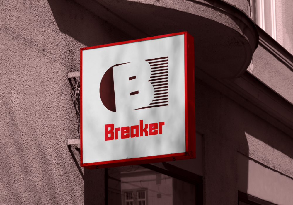
As breaker promises to interrupt struggles, failures and skepticism to replace with real support, fitness success and looks to stand out as a loving, energetic and stable enough brand, I chose to place one rounded, hanging-unstable shape on the left and stable horizontal lines on the right with bold and strong B intersecting the two in a negative space to absolutely reflect Breaker’s position and how the life of fitness strugglers and skeptics should feel after meeting Breaker.